Choosing the Right Pigment for Hand-Mixed Watercolors

The difference between a cheap tube and professional pigment is often invisible until you try to layer.
You’re sitting at your desk, working on a wash of cerulean blue, only to find that the second you add a hint of yellow, the whole thing turns into a muddy, brownish mess. It’s frustrating. You followed the instructions, you used distilled water, and you even checked your paper—yet the color won't behave. This isn't usually a mistake in your technique; it's a fundamental mismatch between the pigment density and the binder quality. Understanding how different pigments react to water and light is the difference between a painting that stays vibrant for years and one that fades or turns dull within months.
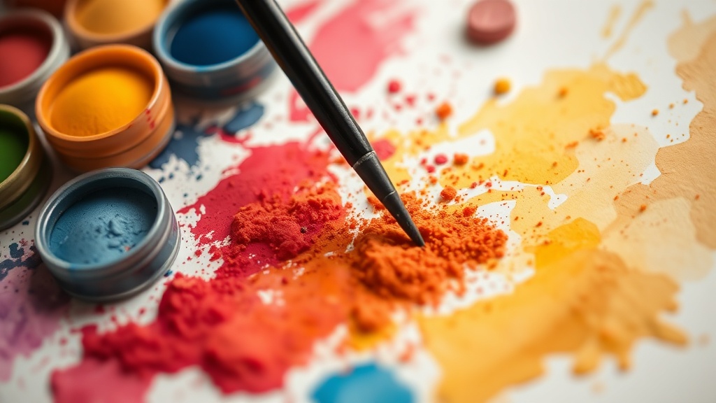
When we talk about watercolor, we aren't just talking about "blue" or "red." We are talking about the chemical makeup of the grit inside that tube. Some pigments are transparent, meaning light passes through them to hit the white paper and bounce back; others are opaque, blocking that light entirely. If you mix an opaque pigment with a transparent one, you lose that luminous glow that makes watercolor so special. It’s a delicate balance of light physics and chemistry.
What makes professional grade watercolor different?
The distinction usually comes down to two things: pigment concentration and the binder. In student-grade paints, manufacturers often use more gum arabic and fillers to keep the price down. This means you're paying for more "filler" and less actual color. In a professional setup, the pigment-to-binder ratio is much higher. This allows for much more intense color with less water, giving you better control over your brushwork.
I’ve seen many painters get stuck in a loop of buying cheap sets because they want to experiment with more colors, but they end up frustrated because the colors don't stay bright once they dry. A high-quality pigment stays true to its wet-state color even after the water evaporates. If you want to see the technical breakdowns of how pigments behave, the Winsor & Newton technical guides offer a deep dive into how light interacts with different pigment types.
Beyond just the color, the stability of the pigment matters. Some pigments are "lightfast," meaning they won't fade when exposed to UV rays. Others are highly reactive and will change color if they touch certain other minerals. If you're working on a piece that you intend to frame and hang, you cannot afford to ignore the lightfastness rating on the tube. It's not just a suggestion; it's a survival guide for your artwork.
Can I mix any colors together in watercolor?
The short answer is no. If you want to keep your paintings looking clean and vibrant, you have to respect the color wheel and the chemical properties of your pigments. If you mix two colors that both contain a high amount of black or dark sediment, you’ll end up with a flat, dead color. This is a common pitfall for beginners who try to create complex greens or purples by mixing basic primaries.
- Transparent Pigments: Best for glazing and layering. They allow light to bounce through the layers, creating depth.
- Opaque Pigments: Great for adding highlights or covering mistakes, but they can make a painting look "chalky" if overused.
- Granulating Pigments: These are pigments with larger particles that settle into the valleys of your paper, creating a beautiful, textured effect.
If you are interested in the more scientific approach to color theory, the Britannica entry on color theory provides a solid foundation for understanding how light and pigment work together. Without this knowledge, you're essentially painting in the dark.
How do I test pigment transparency at home?
You don't need a lab to test your paints. You can do a simple test with any standard watercolor paper. Take a small amount of your paint, mix it with a bit of water, and lay down a thick stroke on your paper. Once it's completely dry, hold it up to a light source. If you can see the texture of the paper through the paint, it's transparent. If the paper looks obscured or even slightly white underneath, it's opaque. This is a quick way to see which colors in your kit are better suited for layering versus which ones should be used for solid-color blocks.
I often suggest keeping a "swatch book" specifically for this purpose. Don't just paint a color; paint a test strip that shows the pigment's transparency, its granulation, and how it dries. Does it get darker or lighter when it dries? Does it become more transparent? These are the details that determine whether a color will work in your actual painting or if it will ruin your hard work mid-session.
When you're building a collection of paints, don't just buy a big set of 48 colors. It's much better to own 12 high-quality, single-pigment tubes that you actually understand. A single-pigment tube (meaning it only contains one colorant) is much more predictable than a "mixed" pigment tube. When you use single-pigment colors, your mixing will always be cleaner, and you won't get those weird, muddy results that happen when you mix two different chemical compounds that don't want to play nice together.